First of all, ensure that the Layout Builder feature is activated. This can be done by navigating to Settings → Document Processing → Module → Document Type and ensure that the Layout Builder slider is set too active as shown below.

After this is done you can access the Layout Builder via Settings → Document Types, once on this page, you can select from the various document types you have created and either select “Edit Layout” as shown below
or if you have sub-document types within a created document type you can select “Document Sub Types” and select “Edit Layout” for the sub document type layout you wish to edit as shown below.
After following the previous steps you will reach a page like the one shown below.
In order to upload a document to the layout builder, simply navigate to the right on the screen
Click on the “Upload Documents” button or drag and drop your desired document into the provided area
Groups can be created by selecting the following icon.
Groups allow you to create different sections on a layout, this makes it easier to separate different groups of data or information to make a layout easier to follow. You can create a title for each group so that a user can know what information they will find in that group.
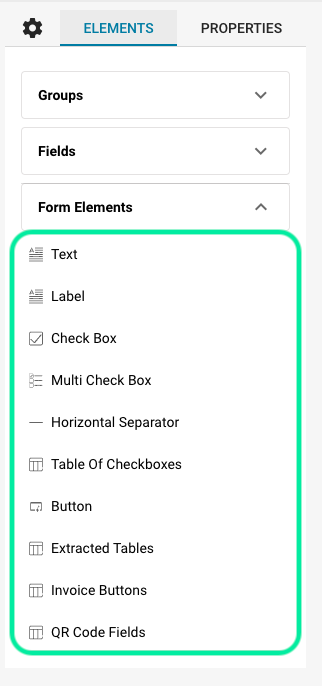
These are a set of default fields that can be dragged and dropped into the layout builder and are available to you to create your desired layout. These include:
Text – This is a text box which creates a field in the layout that can have text entered into it once on the validation screen.
Label – This is a field that can be used to create uneditable text, this could be used to create sub-headings or any other desired uneditable text when on the validation screen.
Checkbox – This creates a boolean type field which can be checked or unchecked.
Multi Checkbox – This functions the same way as the “Checkbox” but can be used when the user knows they will be adding multiple checkboxes in one section.
Horizontal Separator – This creates a horizontal line on the layout that can be used to split up sections within a group on the layout.
Table of Checkboxes – This lets the user create a table of checkboxes consisting of custom x- and y-axis values, eg.

Button – This creates a clickable button on the validation screen within the layout that can be set to one of three functions, including: Export, Export mit Sonderwunsch or Reject.
Extracted Tables -This allows you to place an area on the document layout that illustrates the table that gets extracted from the document. For information click here.
Invoice Buttons – This element lets you drag and drop a set of buttons that are optimised for invoices. When on the validation screen, when you select the invoice type (either cost or purchase) the PO Matching or Auto Accounting will disappear accordingly.

QR Code Fields – This element allows you to drag a drop a block that will display all the extracted information from a document when a QR code is present.
The user is able to create their own custom groups and fields for a document type, this can be done when originally creating a document type but also by selecting “Fields” when on the Document Types page in Settings.


In order to create the above space on the layout, a “Label” from the Form Elements must be used in a special way. The reason for this is that the Layout Manager operates according to a 100 space per line system in that 1 space represents 1 percent of a line, this means that fields can only take up 100 spaces per line as show below.
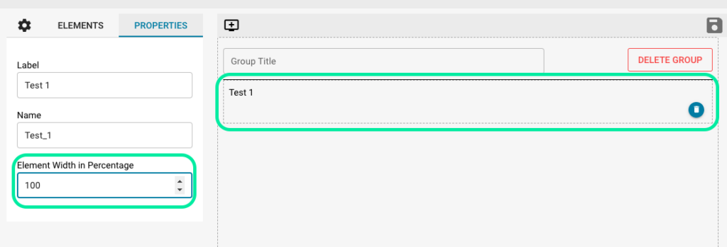
This means that the user must build the layout line by line according to this rule. For example lets say you would like to add the fields “Name” and “Date” in the same line but would like the “Name” field to be larger. This can be done by dragging and dropping the “Text” field from the Field Elements drop down and naming each field “Name” and “Date” as shown.
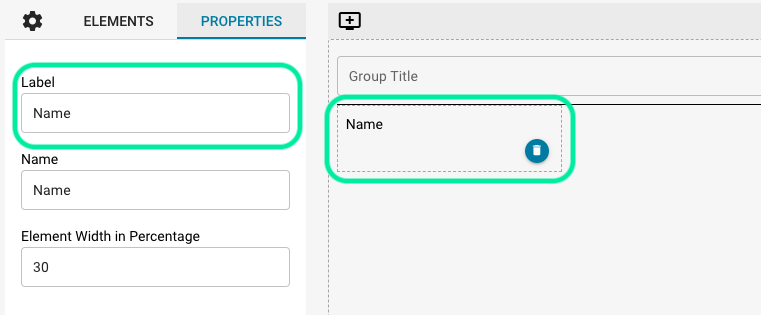
The problem now exists that they are both the same size of 33 (this is the default size of all dragged and dropped fields) but you would like the “Name” field to be larger than the “Date” field and both fields should take up the entire line on the layout. Therefore, by following the 100 percent rule, you can set the “Name” and “Date” fields to any combination of 100 that you would desire. This of course depends on how large you would like each individual field but for the purpose of this example we will set the “Name” field to 70 and the “Date” field to 30, the results are:
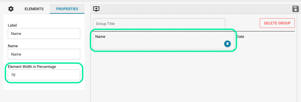
This same rule applies to all fields in the Layout Builder.
Now that this rule has been explained, creating blank spaces will make more sense. As previously mentioned, in order to create a blank space you have to use a “Label” from the Form Elements.
For example, let’s say that you would like to create a blank space between these two fields.

Step one is to drag and drop a “Label” between these two fields, once added you can click on the “Label” field you just added and on the left you will be presented with the properties of the field. Now, in the same way you would create or change the name of a field as shown previously, you will remove any name from the “Label” property like so
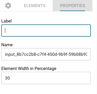
The result from doing this will then be

There is now a gap between the two fields. This gap can be extended or shortened according to the 100 percent rule discussed earlier, and with these functions you can create any desired layout.
You are currently viewing a placeholder content from Vimeo. To access the actual content, click the button below. Please note that doing so will share data with third-party providers.
More InformationYou are currently viewing a placeholder content from YouTube. To access the actual content, click the button below. Please note that doing so will share data with third-party providers.
More InformationYou need to load content from reCAPTCHA to submit the form. Please note that doing so will share data with third-party providers.
More InformationYou are currently viewing a placeholder content from Vimeo. To access the actual content, click the button below. Please note that doing so will share data with third-party providers.
More InformationYou are currently viewing a placeholder content from YouTube. To access the actual content, click the button below. Please note that doing so will share data with third-party providers.
More InformationYou are currently viewing a placeholder content from Bunny Stream. To access the actual content, click the button below. Please note that doing so will share data with third-party providers.
More InformationYou are currently viewing a placeholder content from Wistia. To access the actual content, click the button below. Please note that doing so will share data with third-party providers.
More InformationYou are currently viewing a placeholder content from Facebook. To access the actual content, click the button below. Please note that doing so will share data with third-party providers.
More InformationYou are currently viewing a placeholder content from Instagram. To access the actual content, click the button below. Please note that doing so will share data with third-party providers.
More InformationYou are currently viewing a placeholder content from X. To access the actual content, click the button below. Please note that doing so will share data with third-party providers.
More Information